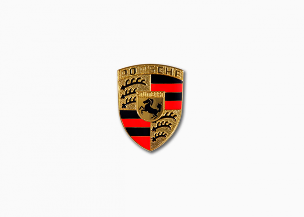
First logo
In 1948, the coat of arms of the Kingdom of Württemberg was chosen as a logo for Porsche.It’s a pattern of stag horns and red & black stripes on a yellow background. We decided to leave the background, as well as the key graphic elements, unchanged. The color combination is reminiscent of fire with its strong and indomitable appearance –
strong and indomitable, like the Porsches.
History of logo Porsche change:
1963
logo of 1963 this logo of Porsche hase the same base, like primal design.But background turns golden instead of yellow.This color scheme embodied elite status and cool disign.Porsche is written in capital letters. The inscription is written in italics in underlined font. The text color is the same as the main logo.
1973
In 1973, the trademark red stripes on Porsche’s logo adopted a more subdued, deep crimson tone(the changes in the company’s logo can best be seen when examining photos from this period).
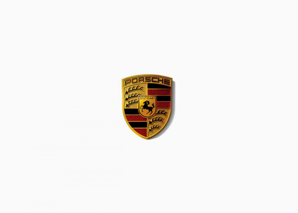
1994
In 1994 Porsche logo remained practically unchanged, except that the surname of the founder of the company was written in black, and a horse depicted more schematic.
2008
2008 – return of original, scarlet, shade of Porsche logo stripes. The rest of the logo does not change.
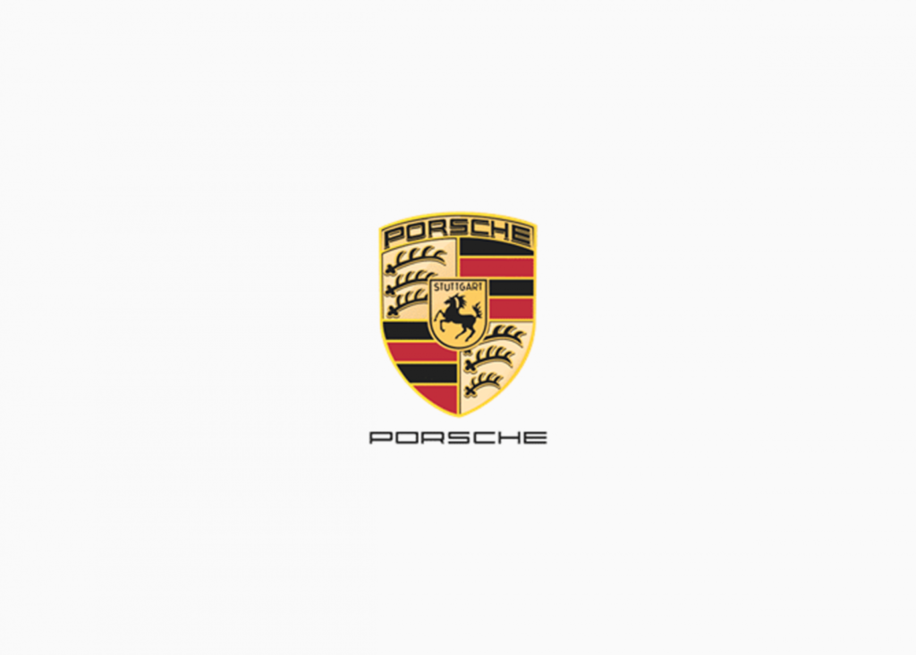
2014
2014 changed several tones of colors but retained the overall style. The logo design has been used for this brand in the present time.
Conclusion

The Porsche logo has not changed significantly, unlike its technical specifications and exterior designs, which have. As the quality and safety of every vehicle we release always remains unchanged, so does the logo.